Emily Costopoulos Real Estate
Emily Costopoulos is a real estate investment expert who shifts the status quo by showing women there is another way to build.
Through telling her own story and honestly sharing how she invests her money and builds her real estate business, she empowers others and amplifies the collective ability for women to rise in the real estate market.
Our goal was to not only beautifully showcase Emily’s listings, but to establish a brand centered around real estate growth, empowerment and education.
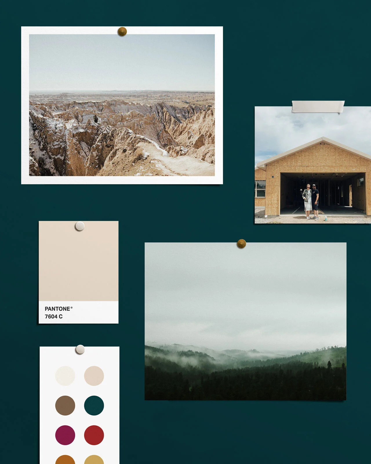
The natural beauty of Emily’s home of the Black Hills, South Dakota greatly inspired our design, along with her own incredible landscape photography of the area.
BRAND VALUES
Freedom, Empowerment, Growth, Connection, Integrity